Lab 5: Real-Time Dashboards
In the final lab of the Real-Time Intelligence series, you’ll build the Gold layer using materialized views and create a real-time dashboard powered by live KQL queries. Learn how to turn streaming data into instantly actionable insights with dynamic visuals that auto-refresh.

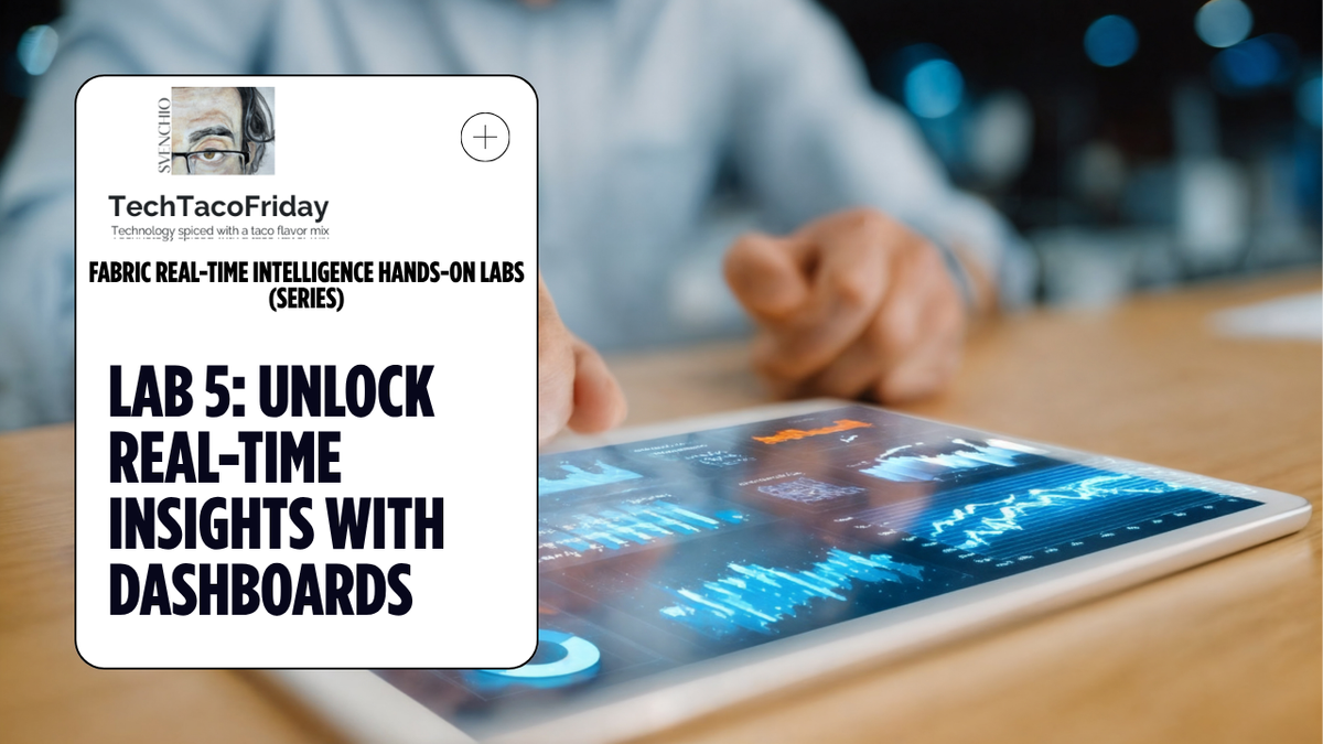
This is the lab 5 out of 5 of the series
Contents
- Introduction
- Gold Layer
- Task 1: Create Gold Layer with Materialized Views
- Real-Time Dashboards
- Task 2: Create Real-Time Dashboard and connect to a data source
- Task 3. Create a Base query for the dashboard
- Task 4. Create Stat tile "Last Update From Stream"
- Task 5. OPTIONAL - Create Map tile "Highest Bike Usage Rate"
Introduction
Thus far, in this course you have developed your Bronze and Silver layers, commonly referred to as "raw data" and "enriched data", respectively. In this lab, you will focus on creating your Gold layer, also known as "aggregated data". In KQL, these aggregated views of data are created using Materialized Views. Materialized views are primarily utilized to enhance performance and efficiency by precomputing and storing the results of complex queries.
Gold layer
Task 1: Create Gold Layer with Materialized Views
Now that you have your transformed layer of data within the Silver Layer you can start to perform analytics with trusted, validated, and enriched data within a Power BI report, RTI Dataset, or just by simply authoring some KQL queries.
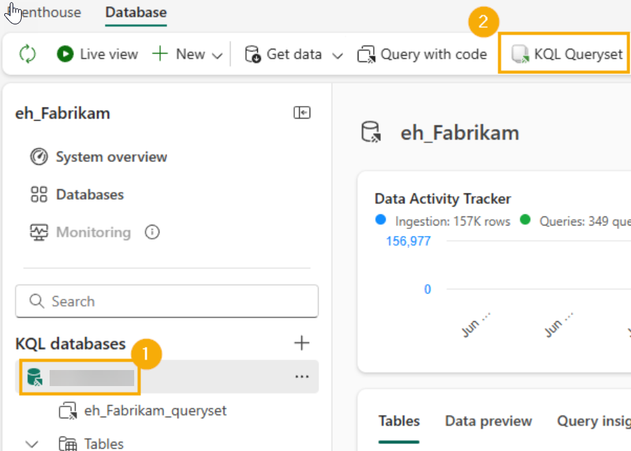
#1. Go into your KQL Database 1️⃣, from the menu bar at the top, click KQL Queryset 2️⃣ and name the Queryset rt_kqlqs_create-gold-layer
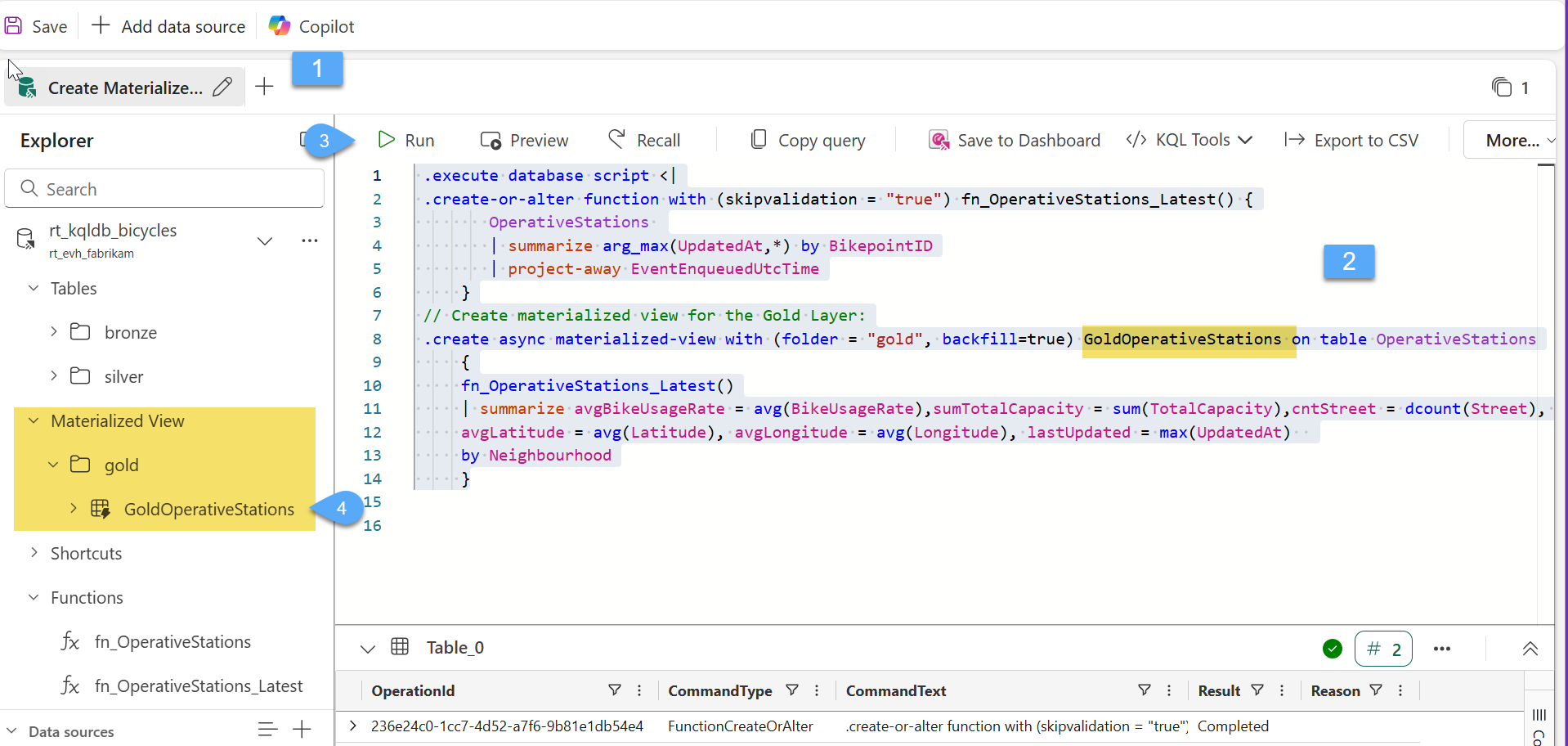
#2. Let's rename the default tab that we are working to Create Materialized View 1️⃣, copy the Code below and paste it into the Queryset window 2️⃣, select all the code and click Run! 3️⃣. You will also see another folder was created in the KQL Database object explorer. Expand the Materialized View folder, expand the gold folder and you will find your GoldOperativeStations view within 4️⃣
//Defines a reusable function** that returns the **latest record per BikepointID** from the `OperativeStations` table.
//Uses `arg_max(UpdatedAt, *)` to get the most recent entry for each bike station.
//Removes the `EventEnqueuedUtcTime` column from the output using `project-away`.
 .execute database script <|
 .create-or-alter function with (skipvalidation = "true") fn_OperativeStations_Latest() {
        OperativeStations
        | summarize arg_max(UpdatedAt,*) by BikepointID
        | project-away EventEnqueuedUtcTime
     }
//Creates a materialized view** named `GoldOperativeStations` in the `"gold"` folder.
//**Backfill=true** ensures historical data is processed.
//It uses the previously defined function to get the latest operative station data.
//Then it **aggregates metrics** by `Region` and `Neighbourhood`
 .create async materialized-view with (folder = "gold", backfill=true) GoldOperativeStations on table OperativeStations
     {
     fn_OperativeStations_Latest()
     | summarize avgBikeUsageRate = avg(BikeUsageRate),sumTotalCapacity = sum(TotalCapacity),cntStreet = dcount(Street),
     avgLatitude = avg(Latitude), avgLongitude = avg(Longitude), lastUpdated = max(UpdatedAt)
     by Region, Neighbourhood
     }
Real-Time Dashboards
🤓 Before we move forward with creating the real-time dashboard, it’s important to understand a few basic building blocks that make up this experience in Microsoft Fabric:
- Tiles: Visual elements (such as charts, KPIs, or tables) that display live data. Each tile is powered by a real-time KQL query and refreshes automatically as new events arrive.
- Base Query: The core KQL query behind each tile. It defines what data is shown, how it's filtered or aggregated, and how it's visualized.
- KQL Queryset: A collection of reusable KQL queries that serve as the data source for dashboard tiles. It helps you organize and manage multiple queries efficiently.
- Data Sources: Typically, these are KQL tables or materialized views that are fed by Eventstreams, enabling continuous ingestion and transformation of real-time event data.
Task 2: Create Real-Time Dashboard and connect to a data source
#1. Open the Fabric workspace for the course, click on the + New Item 1️⃣ button to create a new item and create a new Real-Time Deshboard 2️⃣3️⃣
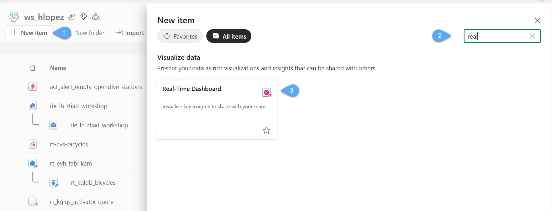
#2. Name the dashboard as rt_dashb_operative-stations and click Create
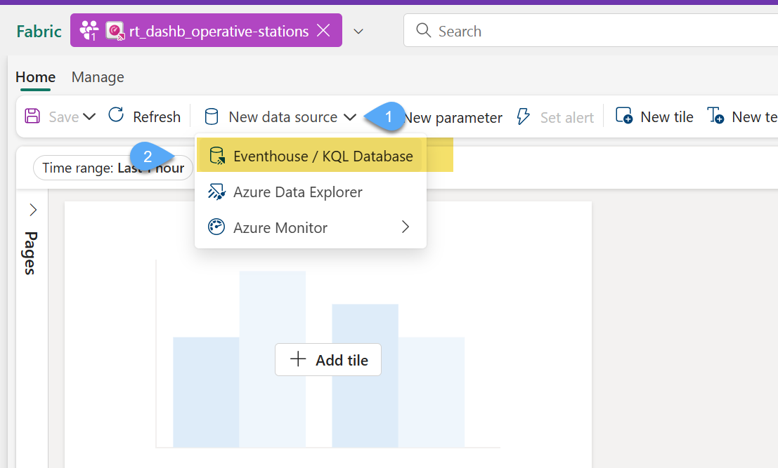
#3. Connect the RT Dasboard to our KQL database by click on New data source 1️⃣, and choose Eventhouse / KQL Database 2️⃣
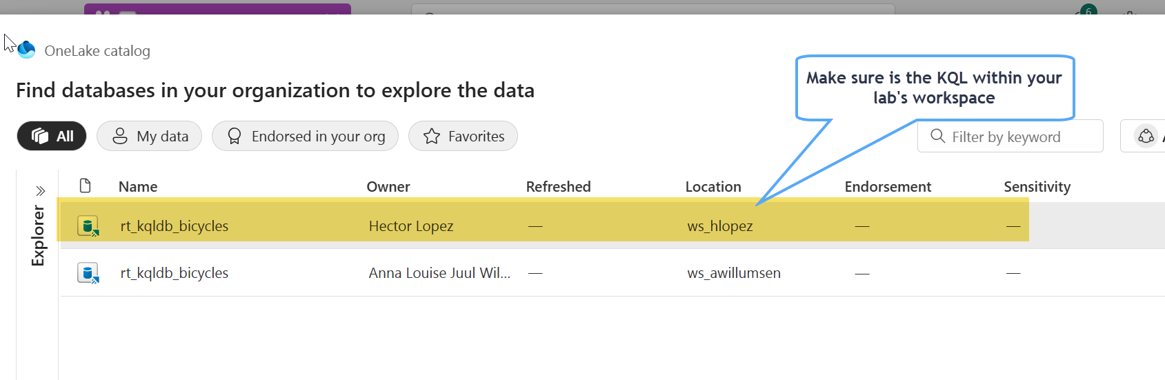
#4. Select your KQL Database in your workspace and click Connect
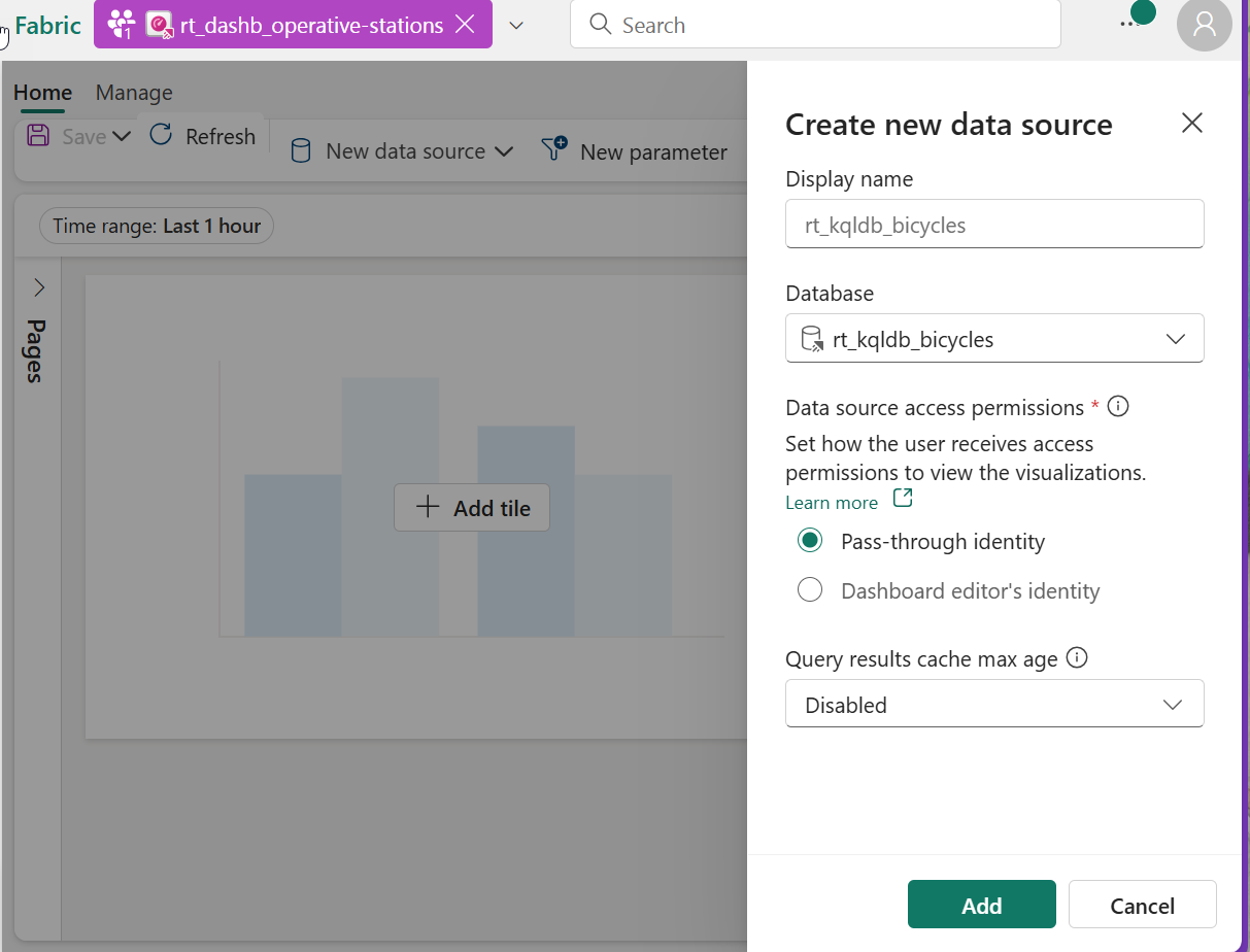
#5. Leave the default option while create the new data source and click Add. You can choose to get cached results when issuing a query, you'll experience better query performance and lower resource consumption if your query's results can be returned by the cache. However, this performance comes at the expense of some "staleness" in the results
Task 3: Create a Base query for the dashboard
A base query as the primary KQL query that defines the live data source behind a visual. It continuously runs against a KQL table or stream and feeds real-time updates to the dashboard. It’s optimized for streaming data and supports basic transformations like filters, projections, and aggregations to drive live insights.
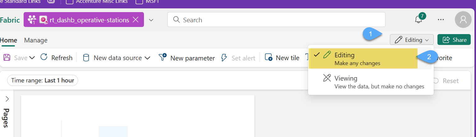
#1. let's make sure the Dashboard is on Edit mode 1️⃣2️⃣
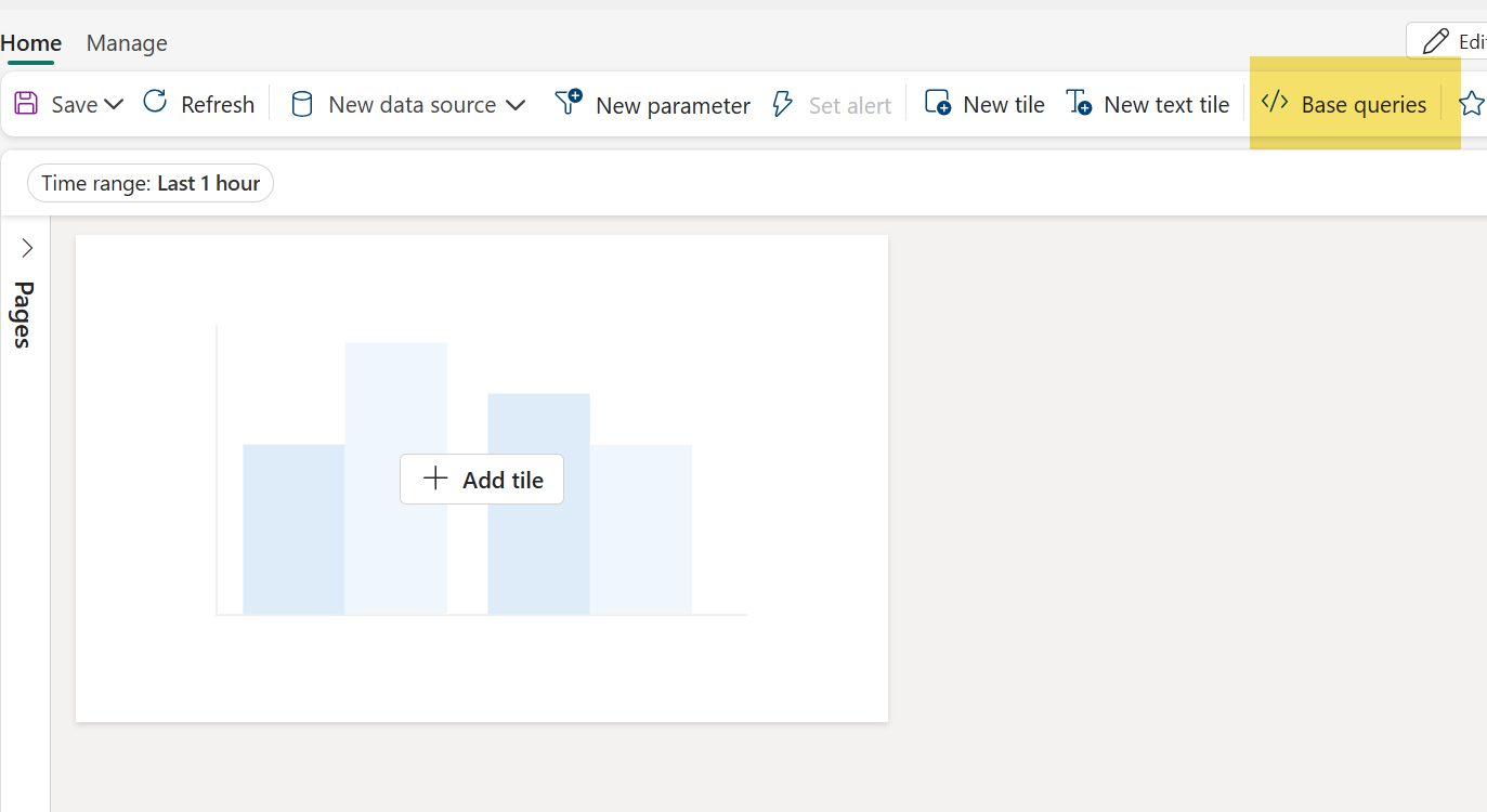
#2. Click on Base queries and then click on + Add
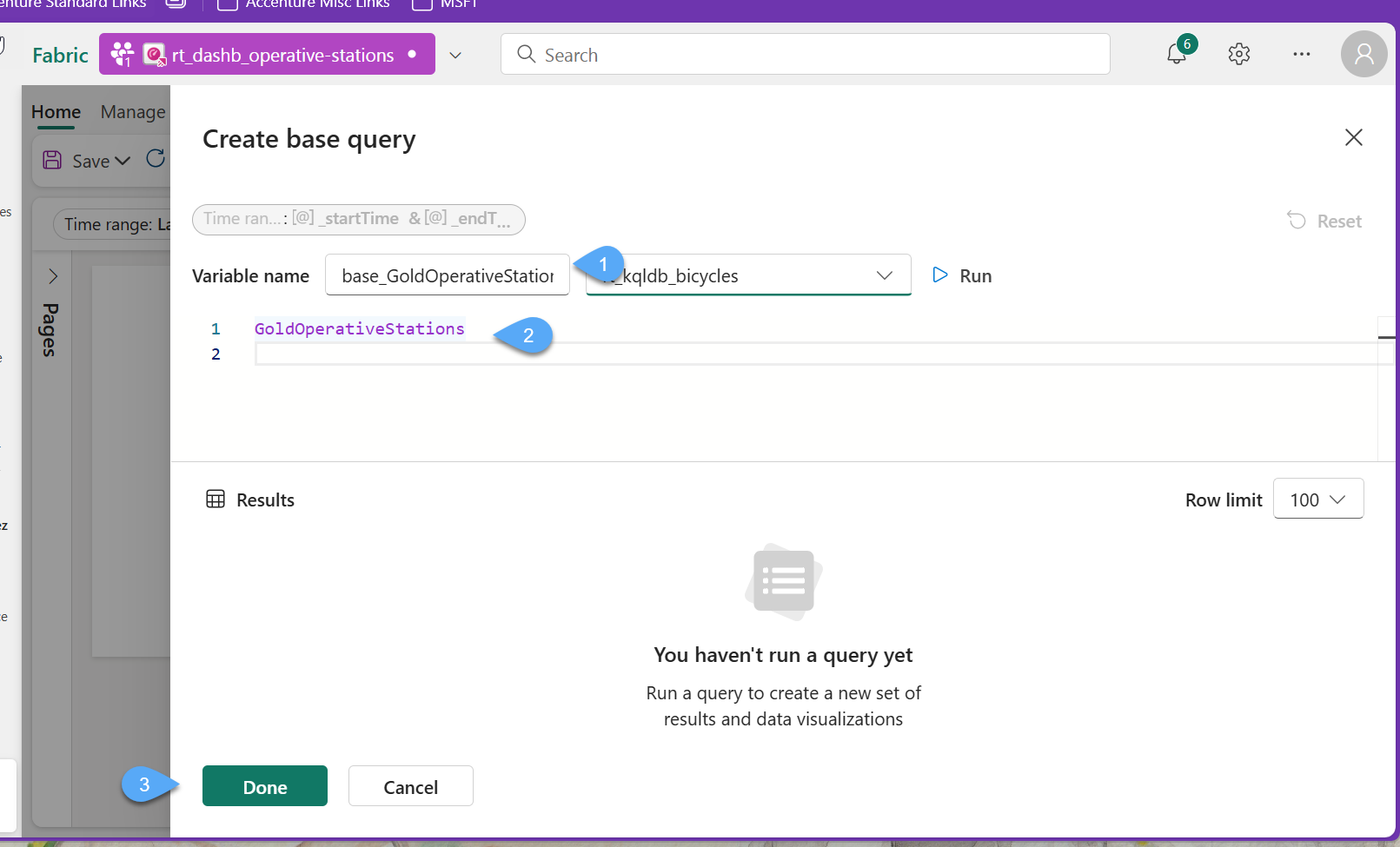
#3. Our base query will be our materialized view GoldOperativeStations, this will be expose to other queries as a variable, hence, we need to provide the variable name base_GoldOperativeStations 1️⃣, replace the query 2️⃣ and click Done 3️⃣, and Close on your way back to the report designer.
//This is our materialized view
GoldOperativeStations
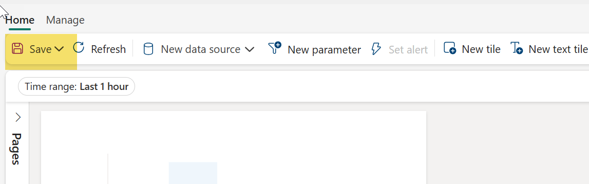
#4. Remember to Save your progress
Task 4: Create a Stat tile "Last Update from Stream" Tile of type
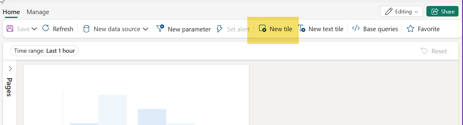
#1. Click on New tile
#2. Copy & paste the following query 1️⃣, click Run 2️⃣ and then + Add Visual 3️⃣
//Shows the last time we received data in our stream
base_GoldOperativeStations
| summarize lastUpdateFromStream = max(lastUpdated)
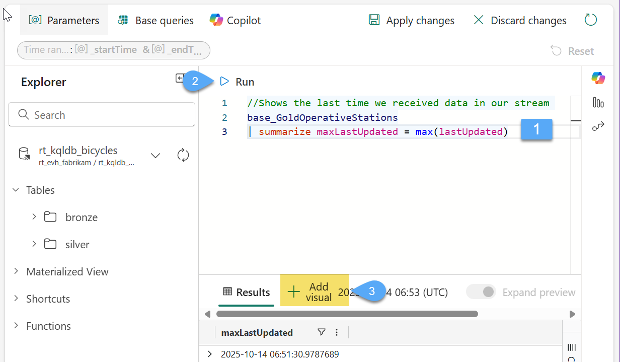
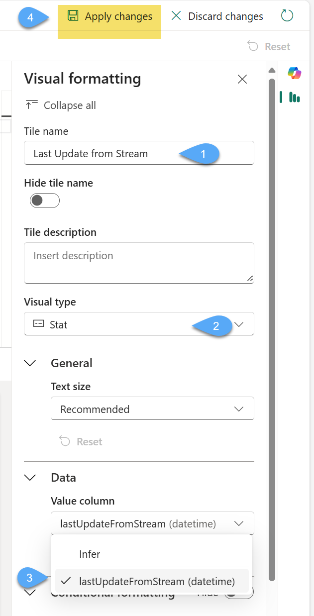
#3. Rename Tile's visual title as Last Update from Stream 1️⃣, choose Stat as visual type 2️⃣ and lastUpdateFromStream as value column 3️⃣ and Apply changes 4️⃣
#4. Allow auto refresh on the report by first switch to Manage 1️⃣, then click Auto refresh 2️⃣, change Enabled toggle button to On 3️⃣ and select Default refresh rate of 30 seconds 4️⃣ and click Apply changes 5️⃣
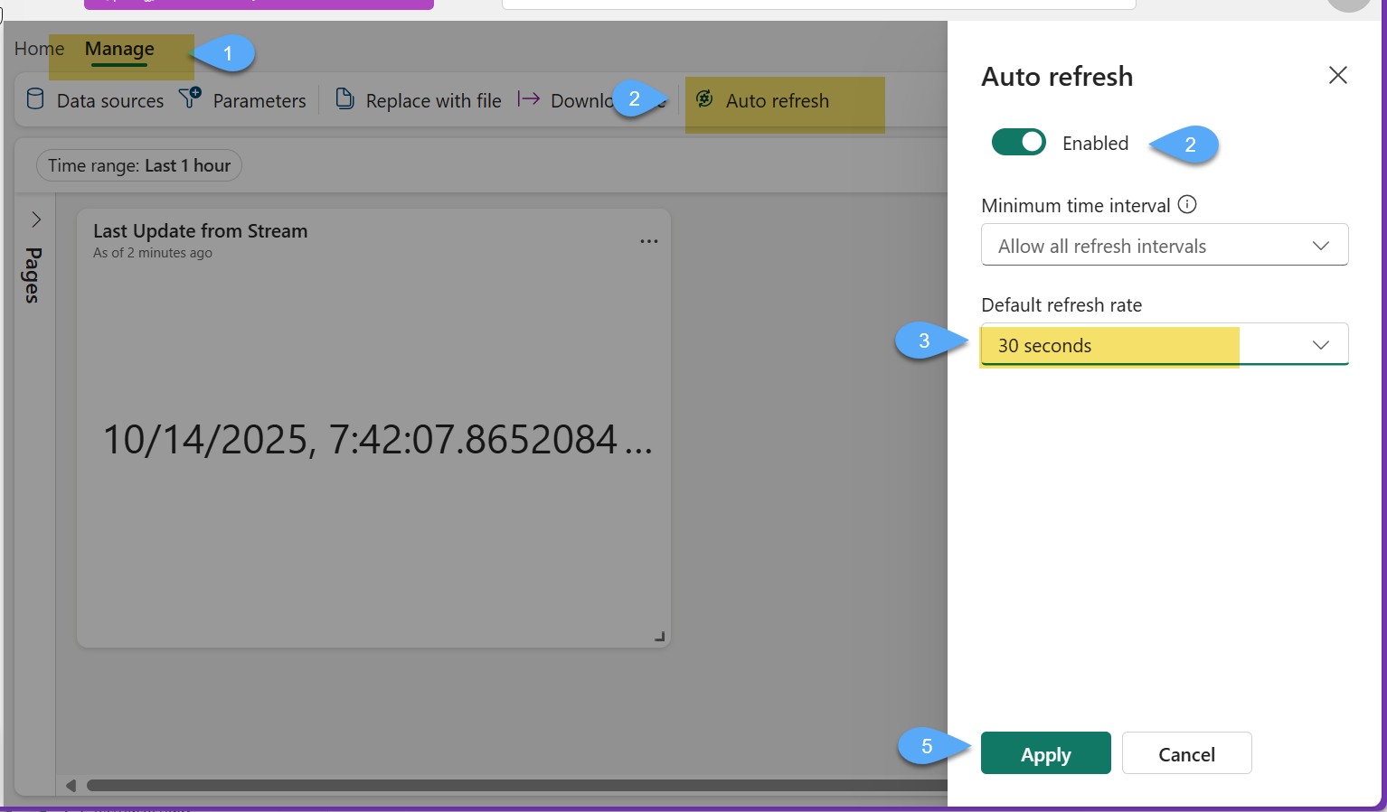
#5. Pay close attention to the tile and notice how it automatically refreshes and shows the last time it is receiving data from the stream 🥳
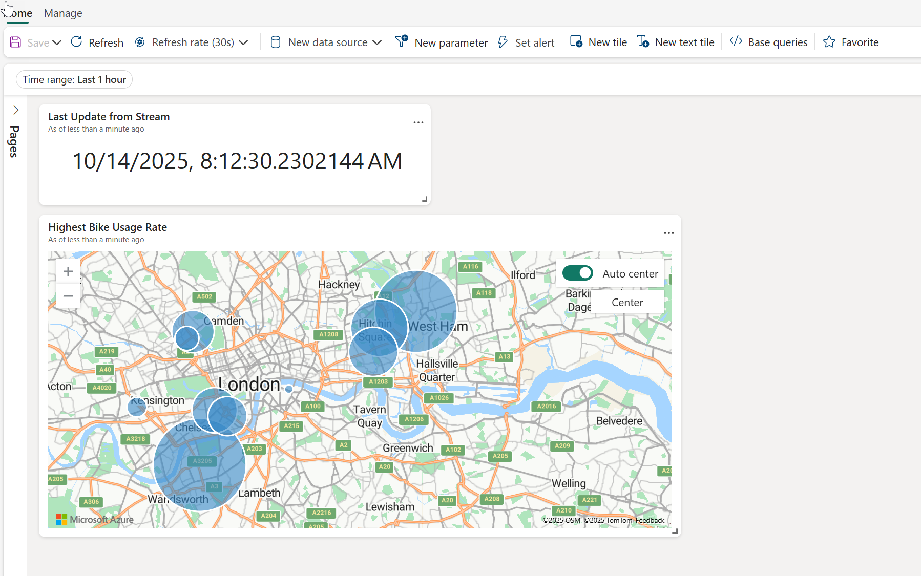
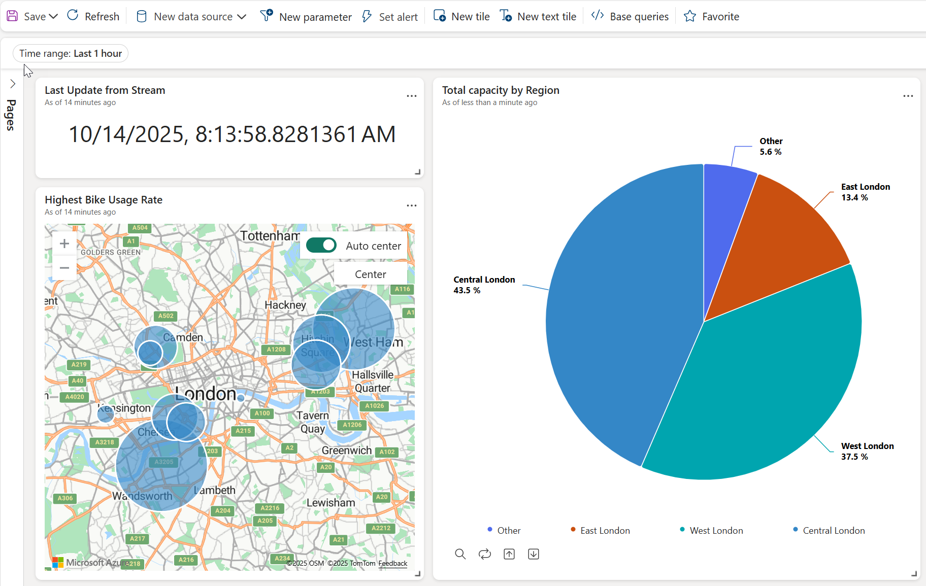
Task 5: Create Map tile "Highest Bike Usage Rate"
#1. Click on **New tile", Copy & paste the following query 1️⃣, click Run 2️⃣ and then + Add Visual 3️⃣
//Selects latitude and longitude columns for the top 15 stations, based on Bike usage rate
base_GoldOperativeStations
| project avgLatitude,avgLongitude,avgBikeUsageRate
| order by avgBikeUsageRate desc
| take 15
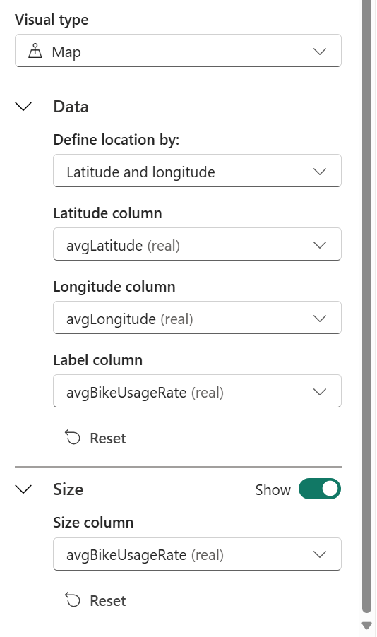
#2. Name the title as Highest Bike Usage Rate and configure the visual as follow and click Apply changes
#3. Arrange the size and distribution of your tiles and click Save
Task 6: Create Pie chart tile "Total Capacity by Region" (OPTIONAL)
#1. Click on **New tile", Copy & paste the following query 1️⃣, click Run 2️⃣ and then + Add Visual 3️⃣
//Calculates Total Capacity by Region
base_GoldOperativeStations
| summarize totalTotalCapacityByRegion = sum(sumTotalCapacity) by Region
#2. Name the title as Total Capacity by Region and configure the visual as follow and click Apply changes
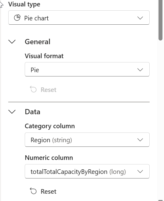
#3. Arrange the size and distribution of your tiles and click Save
Wrap‑Up: What You’ve Learned
In this final lab, you brought your Fabric Real‑Time Intelligence pipeline full circle — from ingestion to insight. Here’s what you accomplished:
- Built the Gold Layer of your Medallion architecture using Materialized Views, optimizing performance by aggregating and storing curated results.
- Designed and configured a Real‑Time Dashboard, connecting it to your KQL Database as a live data source.
- Created base queries to drive tiles and visualizations, including Stat and Map tiles that refresh automatically with each new stream update.
- Understood the importance of auto‑refresh and live insights, turning continuous event data into actionable, business‑ready intelligence.
You now have a working end‑to‑end real‑time data solution, capable of ingesting, enriching, monitoring, alerting, and visualizing data in motion.